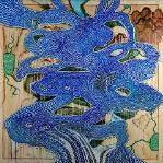
frasky Posted January 21, 2016 Report Share Posted January 21, 2016 Vero, ma sono spariti i colori... così ricorda molto Tomorrow's Modern Boxes, con le silhouette al posto dei "poligoni" colorati.Molto interessante... Il filo conduttore sembrerebbe essere appunto lo stile "geologico" (non saprei come dirlo) associato alle piccole figure umane... Quote Link to comment Share on other sites More sharing options...
notlivingjustkillingtime Posted January 21, 2016 Report Share Posted January 21, 2016 Geologico - Informale / Materico - lande di Kid A o Tmb - figure di Ok Computer Quote Link to comment Share on other sites More sharing options...
Lacatus Posted January 21, 2016 Author Report Share Posted January 21, 2016 Il filo conduttore sembrerebbe essere appunto lo stile "geologico" (non saprei come dirlo) associato alle piccole figure umane...Però sembra che i colori siano scomparsi e questo è un elemento importantissimo. Quel rosso e quel giallo dell'artwork col testo di Silent Spring comunicavano energia vulcanica, una roba tipo Amnesiac + The King Of Limbs... mentre questo nuovo artwork mi fa pensare a quello che ha appena scritto Notlivingjustkillgtime: Ok Computer + Tomorrow's Modern Boxes. Quote Link to comment Share on other sites More sharing options...
Myork Posted January 21, 2016 Report Share Posted January 21, 2016 Vero, ma sono spariti i colori... così ricorda molto Tomorrow's Modern Boxes, con le silhouette al posto dei "poligoni" colorati.Molto interessante... Qui http://www.wasteheadquarters.com/schedule Thanks Quote Link to comment Share on other sites More sharing options...
Lacatus Posted January 21, 2016 Author Report Share Posted January 21, 2016 ATTENZIONEEEEhttps://www.instagram.com/p/-yjDWwsNoU/+https://www.instagram.com/p/thWbF2sNsC/ Quote Link to comment Share on other sites More sharing options...
frasky Posted January 21, 2016 Report Share Posted January 21, 2016 A parte il font che non mi torna, sono ottimista. Sono uscite fuori cose interessanti e penso che il meglio lo stiano tenendo da parte proprio per il disco. Quote Link to comment Share on other sites More sharing options...
Sexbeatles Posted January 21, 2016 Report Share Posted January 21, 2016 Bello bello bello, chi se ne frega del font. Quote Link to comment Share on other sites More sharing options...
echoes Posted January 21, 2016 Report Share Posted January 21, 2016 Lavoro molto bello, interessante l'uso delle silouhette. Sempre molto architettonico Stanley. Quote Link to comment Share on other sites More sharing options...
OKPC_82 Posted January 21, 2016 Report Share Posted January 21, 2016 Solo a me ricorda il video Midnight dei Coldplay? :-D Quote Link to comment Share on other sites More sharing options...
Sig.Bakke Posted January 21, 2016 Report Share Posted January 21, 2016 Vediamo come si evolve la cosa, in effetti rimanda a quello parigino per tanti elementi.Ma la scala cromatica è opposta e pure la pennellata qui viene nascosta, due differenze non da poco.Magari questa è solo una versione alternativa per la pagina commerciale/tour Quote Link to comment Share on other sites More sharing options...
Wanderer Posted January 21, 2016 Report Share Posted January 21, 2016 le persone in bianco mi ricordano certi artwork di ok computer Quote Link to comment Share on other sites More sharing options...
Tiqqun Posted January 21, 2016 Report Share Posted January 21, 2016 https://www.instagram.com/p/-yjDWwsNoU/+https://www.instagram.com/p/thWbF2sNsC/Nero e biancoold and newmi ricorda una foto stampata al contrarioLo preferisco a quello vulcanico (pur molto bello) Quote Link to comment Share on other sites More sharing options...
Lacatus Posted January 21, 2016 Author Report Share Posted January 21, 2016 Ho fatto il negativo, perché nell'arwotk vulcanico le silhouette erano nere...Ecco il risultato Quote Link to comment Share on other sites More sharing options...
frasky Posted January 21, 2016 Report Share Posted January 21, 2016 Ha ragione tiqqun, vorrei provare a vederla in negativo...le persone diventerebbero nere come in quello di Silent Spring...magari ha senso.Edit: lacatus sempre un passo avanti Quote Link to comment Share on other sites More sharing options...
Tiqqun Posted January 21, 2016 Report Share Posted January 21, 2016 Rispetto a quella postata da Lacatus (grazie!) quella con le sagome bianche e il fondo scurissimo mi appare davvero senza alcuna salvezza.L'altra è ancora "cupa" ma più legata ad un crepitio naturale del fondo, come terroso...alla fine più reale, meno apocalittico.La prima è fredda, la seconda terrosa.Dubbio: Bartòk non è proprio freddo, soprattutto nella parte etnomusicale...il riferimento lo trovavo più affine al vulcano....che abbiano in mente un lp in due parti? KidA e Amnesiac - prima parte e seconda parte? Old and new non mischiate ma ben separate?Ma non ne sono convinta granché...suggestioni.. Quote Link to comment Share on other sites More sharing options...
Purenoise Posted January 21, 2016 Report Share Posted January 21, 2016 domanda da ignorante: ma questi disegni mezzi colorati o in bianco e nero poi verranno riempiti con colori ecc? non ricordo se era stato così anche per l'artwork di tkol o twisted words Quote Link to comment Share on other sites More sharing options...
Lacatus Posted January 21, 2016 Author Report Share Posted January 21, 2016 La mia impressione è che quest'immagine è fortemente manomessa:1) è un negativo (le silhouette non possono essere bianche)2) è un dettaglio infinitesimale (ricordate quanto erano piccole, quasi invisibili, le silhouette nel dipinto "vulcanico"?)e a questo punto aggiungerei anche:3) potrebbe essere desaturata, scolorita, ridotta alla scala dei grigi tramite software, per cui l'originale ha i colori del dipinto "vulcanico"... Quote Link to comment Share on other sites More sharing options...
Sig.Bakke Posted January 21, 2016 Report Share Posted January 21, 2016 Esatto lac, personalmente credo proprio sia desaturata e poi passata al negativo Quote Link to comment Share on other sites More sharing options...
Lacatus Posted January 21, 2016 Author Report Share Posted January 21, 2016 Quindi ci saranno i colori del vulcano... Quote Link to comment Share on other sites More sharing options...
Tiqqun Posted January 21, 2016 Report Share Posted January 21, 2016 La mia impressione è che quest'immagine è fortemente manomessa:1) è un negativo (le silhouette non possono essere bianche)2) è un dettaglio infinitesimale (ricordate quanto erano piccole, quasi invisibili, le silhouette nel dipinto "vulcanico"?)e a questo punto aggiungerei anche:3) potrebbe essere desaturata, scolorita, ridotta alla scala dei grigi tramite software, per cui l'originale ha i colori del dipinto "vulcanico"... quindi se non ho frainteso tu ipotizzeresti un negativo b/n di un'opera simile a quella vulcanica, e magari questo ne è un piccolo dettaglio ingrandito?Interessante.Se fosse così ci sarebbe da capire perché dal colore hanno scelto di virare al b/n. Provo a riflettere su un'altra cosa: alcune opere di pittori minimalisti statunitensi sono opere in bianco e nero, ad es. Robert Morris ha composto un corpus pittorico chiamato "Blind Time" che è stato realizzato senza guardare (bendato etc.)Qui qualcosa:robert morris paintingedit: ok vi ho riletto ora e non ho capito una mazza. Capita.Però Morris ve lo lascio perché mi piace parecchio anche se è OT Quote Link to comment Share on other sites More sharing options...
Lacatus Posted January 21, 2016 Author Report Share Posted January 21, 2016 quindi se non ho frainteso tu ipotizzeresti un negativo b/n di un'opera simile a quella vulcanica, e magari questo ne è un piccolo dettaglio ingrandito?Interessante.Se fosse così ci sarebbe da capire perché dal colore hanno scelto di virare al b/n. Probabilmente per non spoilerare l'artwork ufficiale che sarà colorato (come quello "vulcanico" insomma).Altrimenti, se questa versione virata, decolorata, ingrigita sarà quella l'artwork ufficiale vuol dire che la direzione musicale è cambiata, da qualcosa di caldo, ritmato e qualcosa di più freddo e ambientale... Staremo a vedere...non manca molto all'annuncio.Provo a riflettere su un'altra cosa: alcune opere di pittori minimalisti statunitensi sono opere in bianco e nero, ad es. Robert Morris ha composto un corpus pittorico chiamato "Blind Time" che è stato realizzato senza guardare (bendato etc.)Qui qualcosa:robert morris paintingMolto belli, non li conoscevo. Grazie! Quote Link to comment Share on other sites More sharing options...
Alfredoloco Posted January 21, 2016 Report Share Posted January 21, 2016 In tema di font...non so se sia nuovo, chiedo ai più esperti...http://lineup.primaverasound.es/2016_artists?id=120 Quote Link to comment Share on other sites More sharing options...
Lacatus Posted January 21, 2016 Author Report Share Posted January 21, 2016 Ho fatto il negativo, perché nell'arwotk vulcanico le silhouette erano nere...Ecco il risultatoVorrei capire che tipo di materiale può avere utilizzato Stanley per ottenere questa materia pittorica grumosa, che nel seccarsi si è spaccata, come un terreno arido... questa sostanza terrosa... Bakke che ne pensi? Quote Link to comment Share on other sites More sharing options...
Sig.Bakke Posted January 21, 2016 Report Share Posted January 21, 2016 Non saprei Lacatus oggi come oggi col digitale ci sono tanti modi per ottenere quell'effetto.È possibile che da una base di pennellate sporche ad acrilico (sporche nel senso di marcate, non sfumate) abbia aggiunto in trasparenza una texture di marmo/terra infranta (magari catturata con una foto) e poi i personaggi (sempre in digitale) subito sopra.Dovrei vedere un'immagine più grande però, perché Stanley raramente lavora in digitale Quote Link to comment Share on other sites More sharing options...
Sig.Bakke Posted January 21, 2016 Report Share Posted January 21, 2016 Comunque sarebbe very old + very new anche qui, fosse così Quote Link to comment Share on other sites More sharing options...

Recommended Posts
Join the conversation
You can post now and register later. If you have an account, sign in now to post with your account.